Figure 1.1: CO2 Data
This project uses high school mathematics (the equation of a line) and the computer to give you an idea of the the scope of the problems we call "Projects." There is also a calculus moral to the story. The main approximation of calculus is to fit a linear function to small changes of a nonlinear function. Large-scale linear approximation makes sense in some problems but works in a different way. There is a pitfall in using a "local" approximation to make a long term prediction.
Global warming is a major environmental concern of our time. Carbon dioxide (CO2) traps heat better than other gases in the atmosphere, so more CO2 makes the atmosphere like a "greenhouse." Increased industrial production of CO2 and decreased conversion of CO2 to oxygen by plants are therefore thought to be causes of a general warming trend around the world. This is the greenhouse effect.
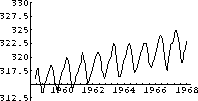
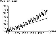
The computer program co2 program contains monthly average readings of CO2 similar to those taken at Mauna Loa Observatory, Hawaii. Figure 1.1 shows a graph of the program's data from 1958 through 1967. (We couldn't obtain the raw data, so approximated it. Our graph looks similar to the published data.) The CO2 level oscillates throughout the year, but there is a general increasing trend that appears to be fairly linear. It is natural to fit a linear function to this general increasing trend.
One way to make a linear approximation is simply to lay a transparent ruler on the graph and visually balance the wiggles above and below the edge of the ruler.
That is a perfectly valid mathematical start, but the computer also has a "Fit" function and it produces the "approximation"
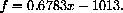
The linear upward trend looks about like the yearly average of the data.
The yearly averages are computed and fit to another approximating function
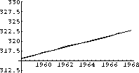
Notice that the first fit to all the data is not the same as the fit to the annual averages of the data, but it is close. Both fits and sets of data are shown in Figure 1.4.


2) How does your approximation compare with the two computer approximations f and g above?
3) Use all three approximating functions f, g, and h to predict the 1983 CO2 average. How much increase in CO2 over the 1958 level is your prediction?
When we did the preceding exercise, our calculation of the
increase in CO2 level over the 1958 level was 17
ppm, for a level of 333 ppm. The measured average turns out to be 343
for an increase of 27 ppm. That is an error of  . The long-term data and prediction are
shown in Figure 1.6.
. The long-term data and prediction are
shown in Figure 1.6.
The worrisome thing is that the average rate of increase from 1968 to 1983 is more than the linear trend of the 1958 to 1968 decade. What is your estimate of the present level of CO2?
You can read more in an article, Under the Sun - Is Our World Warming, in National Geographic, October 1990 (vol.178, nr.40). You can also use the computer to fit nonlinear functions to the data. For example, you might try a quadratic polynomial or exponential fit and use them to make predictions. Unfortunately, we do not know a scientific basis to choose a nonlinear function for our fit, so such predictions are only a curiosity.